How to choose colors in the interior
Color decisions in an interior can strongly influence mood of people who live in the house. Colors influence the perception of space, its illumination and harmony. Because it is very important to choose the colors that will have a positive impact on both the owners and the apartment itself.
Color theory

Before you pick up the colors in the interior, you need to understand the so-called theory of light. It says that there are primary and secondary colors, with intensive mixing of which results in the main color spectrum.
Primary colors:
- red;
- blue;
- yellow.
Secondary colors:
- Orange;
- Violet;
- green.

When mixing these colors, six more new ones are born. As a result, the main range of 12 colors is created. Then you can create within each of them an infinite number of shades. This is done by adding a certain amount of black or white to the base color.
The colors in the sector are divided into two groups:
- warm
- cold
Each of the two groups has certain characteristics. So, warm colors warm and bring closer. Cold shades, on the contrary, alienate.
Colors in the interior
Colors in the interior can not only create a certain mood. They are able to visually enlarge the space or compress it. In some apartments, the unfortunate color scheme creates a feeling of converging walls. This is a very unfavorable effect on the occupants of the room. If there is no comfort and harmony in the house, then, first of all, you should pay attention to the interior decoration. Repair can even serve as a kind of psychotherapy. No wonder psychologists advise every five years to change the situation.
Color solution should not be too academic. Such austerity can create a strikingly dull look. It is better to approach the issue with fantasy, but do not forget the basic laws.
Each room in the house needs a certain design. What is good in the bathroom or nursery may not be suitable for the living room. Therefore, we must carefully consider the finish of each room.
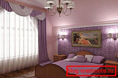
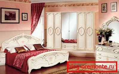
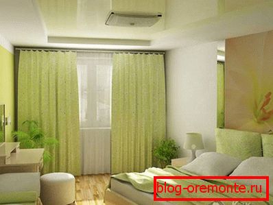
Bedroom
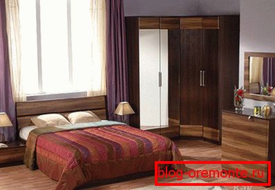
Bedroom - this is the place where people, above all, rest. Therefore, there should not be anything sharp, too bright. It is noted that when there are too saturated bright colors in this room, people begin to suffer from insomnia and sleep disorders. And this is despite the fact that they do not even see the flowers most of the time.
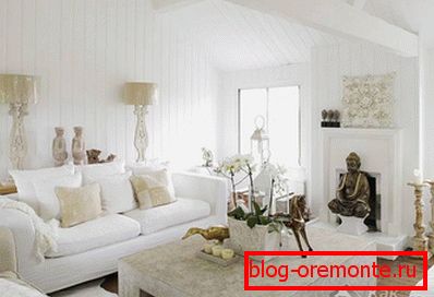
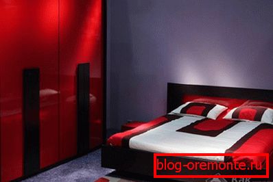
The combination of colors in the interior of the bedroom should be soft and harmonious. From the color palette is better to choose pastel shades. You can give preference to cold tones, for example, pale blue. This color calms and gives peace. Blue-gray color is also a good option. White color may also prevail in the bedroom, however, it is necessary to approach it with care so that the room does not become of hospital type.
In addition to walls and doors, you should also pay attention to the colors of curtains, decorations and bedspreads. Curtains in the bedroom can be made very elegant. True, it should be avoided with too bright colors. For example, the color red is strictly prohibited in this room. If there are pictures on the curtains, then it is better to purchase monotone pads and bedspreads for the bed. If the bedroom is small, then the curtains better to hang light, air. You can purchase curtains with small patterns.
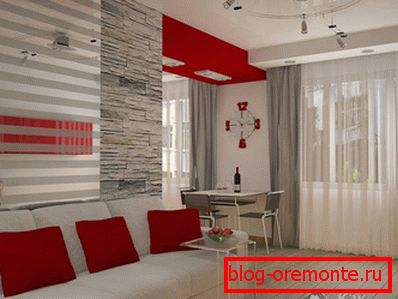
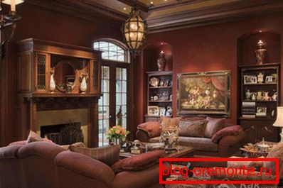
Living room
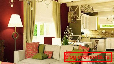
Сочетание цветов в интерьере гостиной может быть самым разнообразным. Здесь уместны и яркие акценты, и приглушенные тона. Очень большое значение имеет стилевое оформление интерьера. Так, гостиная в стиле хай-тек будет иметь больше холодных тонов, однако, с включением яркого акцента. Living room в стиле ампир порадует благородным сочетанием золота и коричневого цвета. Кантри в интерьере позволит привнести в обстановку зеленые и коричневые оттенки.
It is extremely important purpose of the living room. Indeed, in small apartments they are often used as a bedroom. Therefore, we must take into account this moment before the repair. If someone spends hours of rest indoors, it is better to make his design softer. For example, add cold soothing tones. If in the living room only receive guests, then saturated and deep colors with golden and silver accents are appropriate in the room.
In small living rooms, the biggest mistake is decorating the room in red or another flashy color. First, it narrows the space. It seems to inhabitants that the walls are crushing them. Secondly, bright colors significantly reduce the illumination of the premises.
Even a professional designer will not give an unequivocal answer to the question of how to arrange this room. Most likely, it will provide several options for the choice of owners. When decorating the living room must take into account its size. If it is small, then it is better to make walls, doors and ceiling of cold shades. This will visually expand the room. It also makes sense to add a few mirrors to the room.
Entrance hall
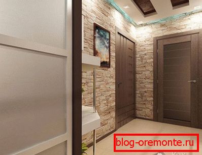
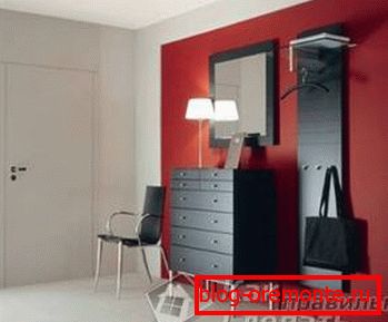 A hallway is a room that meets a person upon entering the apartment. It is a kind of business card at home and sets the tone. Therefore, the combination of colors in the interior of the hallway must be chosen carefully. On the one hand, this is a very important space at home. And on the other - there is a lot of dust.
Entrance hall встречает не только людей. Через нее проходит уличная пыль, грязь, влага. Иногда здесь стряхивают зонт или плащ. Поэтому белый цвет в этом месте противопоказан. Исключение составляют моющиеся материалы, однако, в этом случае за ними потребуется постоянный уход.
Screaming bright colors for the hallway, too, will not work. They will take all the light in the room. The best way to design the hallway - pastel colors. Brown shades are also well suited. Natural textures will look good. For example, you can trim the walls under stone or brick.
Both monophonic materials and materials with a pattern are suitable for a room. If the hallway is small, then you can use horizontal stripes on the finish to visually lengthen the room. If desired, the space can be revived with the help of plants. For this fit those types of vegetation that are unpretentious to the light and temperature.
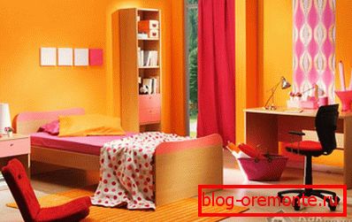
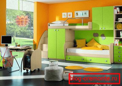
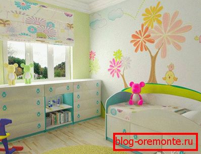
Children's
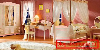
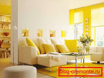
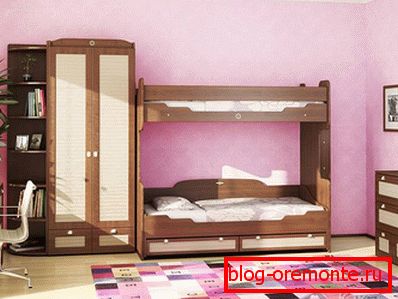
The combination of colors in the interior of the children's room should be different from the living room, but at the same time be in harmony with the overall style of the apartment. Children like no other love bright colors. This is especially true of yellow, orange, green. Indoors you can make an incredibly colorful combination of colors. The main thing is to observe rationality. Images of your favorite cartoon characters and various funny characters will look great here.
At the same time, however, it must be remembered that the children in the nursery also sleep. It is advisable to distinguish between the premises so that they have a quiet place to rest. For older children, you can already arrange a nursery in more soothing colors. This will allow them to concentrate during the serious classes and fall asleep well.
Furniture in the nursery is usually light. Curtains better made brighter. If the basic style in the apartment is high-tech, then in the room for children it is better to do something more "warm" and comfortable. From hi-tech items you can leave some interesting wardrobe.
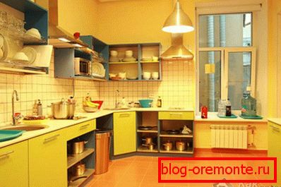
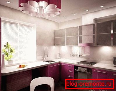
Kitchen
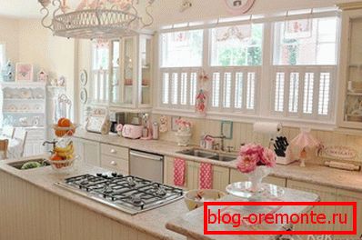
Kitchen — это место, где царит чистота и порядок. Идеальным стилем для оформления этого помещения станет хай-тек или модерн. Модерн — одно из самых популярных направлений для отделки и обстановки кухонных и столовых помещений.
The combination of colors in the interior of the kitchen can be varied. Here it is appropriate red (if the kitchen is not too small). Great for this room is a combination of white with some bright color. It is better to make the room in two colors. In this case, one will be the main, and the second - a contrast.
You can create a more relaxed atmosphere in the kitchen. For this you need to make a design in pastel colors. Looks good in this room beige color. It is better to make curtains light and not too burdened by various details. This will create a feeling of spaciousness and comfort.
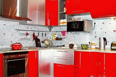
Blue color in the kitchen, according to the observations of psychologists, reduces the appetite. But red, on the contrary, causes a feeling of hunger. Therefore, those who are on a diet or, on the contrary, suffer from lack of appetite, we must take note of this. When creating a joint room of a kitchen and a dining room, it is necessary to separate both parts with the help of different finishes. For example, you can arrange in different colors of the wall or floor. The same should be done when combining a living room with a kitchen. The two rooms should never be confused.
Bright accents can play an interesting role. So, if the living room and kitchen are separated by a bar, then all the attention for some reason concentrates on the counter. To move the focus, it is necessary in one corner of the living room to put a home theater or another point of attention. Then the bar counter will immediately move into the background.
How to choose colors in the interior photo:


Video
The following video will also tell about the color combinations in the interior: